The race to the 2016 presidential election is going strong, there is a lot of talk and the general public opinion is up for grabs. The data for the endeavor below is being pulled from the Twitter Streaming API and I have scheduled new data to be pulled every 6 hours as we reach closer to the election day. The code runs periodically on a DigitalOcean cloud server running Ubuntu 16.04.1x64 and Python 3.5.
The dataset at the time this article was published comprised of 16,232 tweets about Hillary Clinton and Donald Trump. Even though the code walkthrough and the tables are snapshot in time, the visualisations will keep updating automatically as we keep getting new tweets. Watch this space!
Let's load up the data do some exploration.
#importing from Twitter API/JSON dump
import pandas as pd
import numpy as np
tweets = pd.read_csv("/Users/Guneet/TwitterScrape/tweets.csv")
tweets.head(2)
Here are some of the columns of interest in the data:
Some of the interesting stuff we can do here is to compare contents of the tweets. Let's generate a column which tells us what candidates are mentioned in each tweet so we can start comparing tweets about one candidate to another.
#adding candidates column to table based on contents in text column in tweets.csv

def get_candidate(row):
    candidates=[]
    text = row["text"].lower()
    if "clinton" in text or "hillary" in text:
        candidates.append("clinton")
    if "trump" in text or "donald" in text:
        candidates.append("trump")
    return",".join(candidates)

tweets["candidate"] = tweets.apply(get_candidate,axis=1)
The user_location column is another interesting column that tells us about the location of the tweeter mentioned in their Twitter bio. Let's extract the state out of their location to another column called code.
# adding code column specifying state abbreviation from the location of the user

def get_location(row):

    code=[]
    states = {
    'Alabama': 'AL',
    'Alaska': 'AK',
    'Arizona': 'AZ',
    'Arkansas': 'AR',
    'California': 'CA',
    'Colorado': 'CO',
    'Connecticut': 'CT',
    'Delaware': 'DE',
    'Florida': 'FL',
    'Georgia': 'GA',
    'Hawaii': 'HI',
    'Idaho': 'ID',
    'Illinois': 'IL',
    'Indiana': 'IN',
    'Iowa': 'IA',
    'Kansas': 'KS',
    'Kentucky': 'KY',
    'Louisiana': 'LA',
    'Maine': 'ME',
    'Maryland': 'MD',
    'Massachusetts': 'MA',
    'Michigan': 'MI',
    'Minnesota': 'MN',
    'Mississippi': 'MS',
    'Missouri': 'MO',
    'Montana': 'MT',
    'Nebraska': 'NE',
    'Nevada': 'NV',
    'New Hampshire': 'NH',
    'New Jersey': 'NJ',
    'New Mexico': 'NM',
    'New York': 'NY',
    'North Carolina': 'NC',
    'North Dakota': 'ND',
    'Ohio': 'OH',
    'Oklahoma': 'OK',
    'Oregon': 'OR',
    'Pennsylvania': 'PA',
    'Rhode Island': 'RI',
    'South Carolina': 'SC',
    'South Dakota': 'SD',
    'Tennessee': 'TN',
    'Texas': 'TX',
    'Utah': 'UT',
    'Vermont': 'VT',
    'Virginia': 'VA',
    'Washington': 'WA',
    'West Virginia': 'WV',
    'Wisconsin': 'WI',
    'Wyoming': 'WY'}

    text = row["user_location"]
    if text is np.nan:
        text = '-'
    for key in states:
        if key in text or states[key] in text:
            code.append(states[key])
            break

    return ",".join(code)

tweets["code"] = tweets.apply(get_location,axis=1)
tweets.head(2)
One of the things we could look at is the age of the twitter accounts, how old they are and when they were created. This could give us a better understanding about the accounts of users who tweet about either candidate. A candidiate having more user accounts created recently might imply some kind of manipulation owing to fake Twitter accounts.
# create new column called user_age from data in created and user_created column
from datetime import datetime
tweets["created"] = pd.to_datetime(tweets["created"])
tweets["user_created"] = pd.to_datetime(tweets["user_created"])
tweets["user_age"] = tweets["user_created"].apply(lambda x: (datetime.now() - x).total_seconds() / 3600 / 24 / 365)
cl_tweets = tweets["user_age"][tweets["candidate"]=="clinton"]
tr_tweets = tweets["user_age"][tweets["candidate"]=="trump"]
This also gives us an opportunity to extract out the number of tweets made for each candidate by those accounts. Let's look at these two together.
#plotting number of tweets mentioning each candidate combination
import plotly
plotly.tools.set_credentials_file(username='**********', api_key='**********')

import plotly.plotly as py
from plotly.graph_objs import *

import plotly.graph_objs as go

import numpy as np
x0 = cl_tweets
x1 = tr_tweets

trace1 = go.Histogram(
    x=x0,
    histnorm='count',
    name='Clinton',


    marker=dict(
        color='blue',
        line=dict(
            color='blue',
            width=0
        )
    ),
    opacity=0.75
)
trace2 = go.Histogram(
    x=x1,
    name='Trump',


    marker=dict(
        color='red'
    ),
    opacity=0.75
)
data = [trace1, trace2]
layout = go.Layout(
    title='Tweets mentioning each candidate',
    xaxis=dict(
        title='Twitter account age in years'
    ),
    yaxis=dict(
        title='Number of tweets'
    ),
    barmode='stack',
    bargap=0.2,
    bargroupgap=0.1
)
fig = go.Figure(data=data, layout=layout)
py.iplot(fig, filename='number-of-tweets')

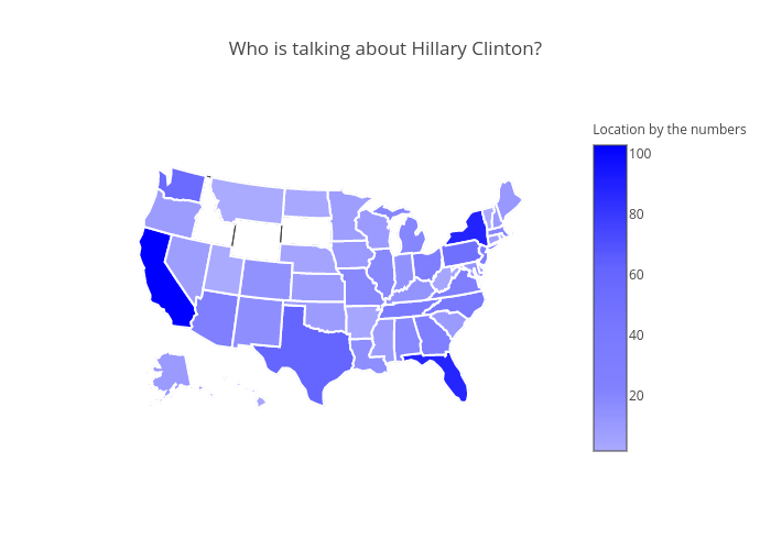
We can take a step further and breakdown the data by the state from which the Tweets are coming from. This would give us an idea about how the this tweet traffic is spread across different states. Let's see how this geographic layout is for Hillary Clinton.
#Visualize tweets by location for Hillary Clinton.

scl = [[0.0, 'rgb(170,170,255)'],[0.2, 'rgb(130,130,255)'],[0.4, 'rgb(120,120,255)'],\
            [0.6, 'rgb(100,100,255)'],[0.8, 'rgb(50,50,255)'],[1.0, 'rgb(0,0,255)']]

data = [ dict(
        type='choropleth',
        colorscale = scl,
        autocolorscale = False,
        locations = clcount.index,
        z = clcount,
        locationmode = 'USA-states',
        text = "Tweets about Cliton",
        marker = dict(
            line = dict (
                color = 'rgb(255,255,255)',
                width = 2
            ) ),
        colorbar = dict(
            title = "Location by the numbers")
        ) ]

layout = dict(
        title = 'Who is talking about Hillary Clinton?',
        geo = dict(
            scope='usa',
            projection=dict( type='albers usa' )
             ))

fig = dict( data=data, layout=layout )
py.iplot( fig, filename='d3-cloropleth-map' )
And now let's do the same for Donald Trump.
# Visualize tweets by location for Donald Trump.

scl = [[0.0, 'rgb(255,170,170)'],[0.2, 'rgb(255,130,130)'],[0.4, 'rgb(255,120,120)'],\
            [0.6, 'rgb(255,100,100)'],[0.8, 'rgb(255,50,50)'],[1.0, 'rgb(255,0,0)']]

data = [ dict(
        type='choropleth',
        colorscale = scl,
        autocolorscale = False,
        locations = trcount.index,
        z = trcount,
        locationmode = 'USA-states',
        text = "Tweets about Trump",
        marker = dict(
            line = dict (
                color = 'rgb(255,255,255)',
                width = 2
            ) ),
        colorbar = dict(
            title = "Tweet Locations")
        ) ]

layout = dict(
        title = 'Who is talking about Donald Trump?',
        geo = dict(
            scope='usa',
            projection=dict( type='albers usa' )
             ))

fig = dict( data=data, layout=layout )
py.iplot( fig, filename='d3-cloropleth-map' )

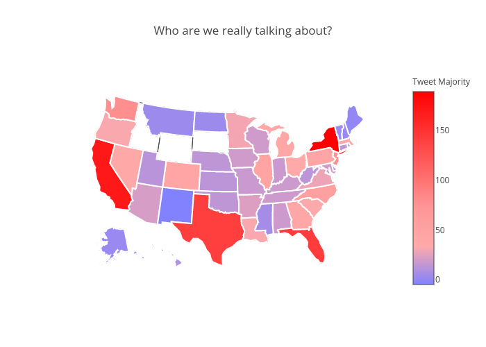
And now we can put the data behind the above two visualisations together and see who gets more traffic across the country. This gives us some interesting insights about certain as to which candidate they are more vocal about.
# Visualize tweet content for Clinton and Trump on state basis

scl = [[0.0, 'rgb(130,130,255)'],[0.2, 'rgb(255,170,170)'],[0.4, 'rgb(255,150,150)'],\
            [0.6, 'rgb(255,100,100)'],[0.8, 'rgb(255,50,50)'],[1.0, 'rgb(255,0,0)']]


data = [ dict(
        type='choropleth',
        colorscale = scl,
        autocolorscale = False,
        locations = filteredpopularityindex.index,
        z = filteredpopularityindex,
        locationmode = 'USA-states',
        text = "Trump and Clinton together",
        marker = dict(
            line = dict (
                color = 'rgb(255,255,255)',
                width = 2
            ) ),
        colorbar = dict(
            title = "Tweet Majority")
        ) ]

layout = dict(
        title = 'Who are we really talking about?',
        geo = dict(
            scope='usa',
            projection=dict( type='albers usa' )
             ))

fig = dict( data=data, layout=layout )
py.iplot( fig, filename='d3-cloropleth-map' )
Sentiment analysis is an area dedicated to extracting subjective emotions from text. It's the process of learning whether the writer feels positively or negatively about a topic.
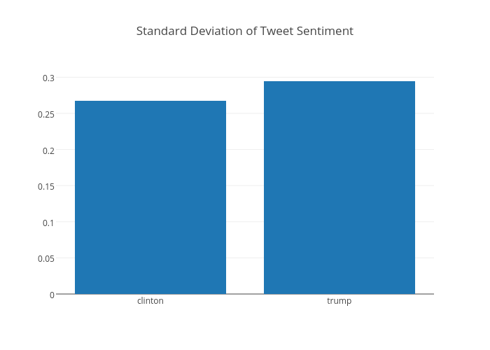
We generated sentiment scores for each tweet using TextBlob, which are stored in the polarity column. We can plot the mean value for each candidate, along with the standard deviation. The standard deviation will tell us how wide the variation is between all the tweets, whereas the mean will tell us how the average tweet is.
TextBlob is a Python library for processing textual data. It provides a platform to dive into common natural language processing (NLP) tasks such as part-of-speech tagging, noun phrase extraction, sentiment analysis, and more.
On the whole, we can see the mean tweet sentiment for each candidate as below.
data = [go.Bar(
            x=['clinton','trump'],
            y=[mean[0],mean[2]]
    )]
layout = go.Layout(
    title='Mean Tweet Sentiment',
)
fig = go.Figure(data=data, layout=layout)
py.iplot(fig, filename='basic-bar')
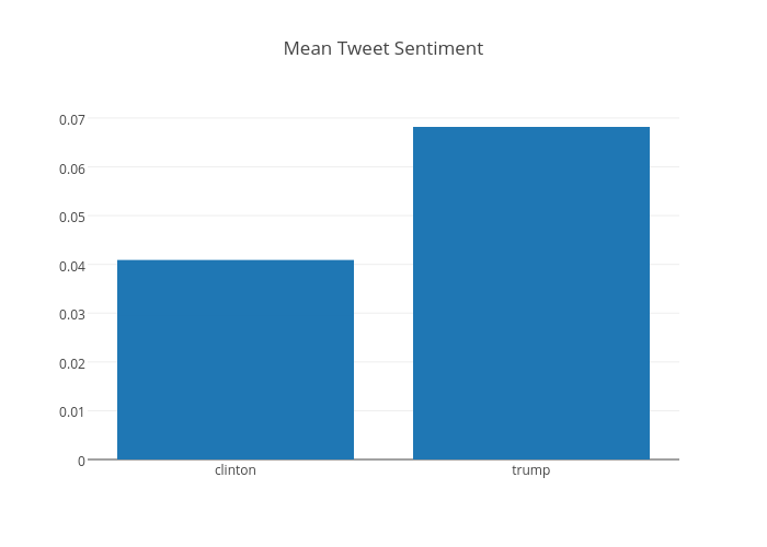
As we can see, Donald Trump is the more talked about candidate and the mean sentiment for him is higher than for Hillary Clinton (or it was, at the time this sentence was published on 14 August 2016. We plot the standard deviation of the sentiment below which tells how wide the variation between all the tweets is.
data = [go.Bar(
            x=['clinton','trump'],
            y=[std[0],std[2]]
    )]
layout = go.Layout(
    title='Standard Deviation of Tweet Sentiment',
)
fig = go.Figure(data=data, layout=layout)
py.iplot(fig, filename='basic-bar')
Next Steps
This has been a good start to pique some interest and we can now branch off in a number of directions. Some things we could check out further :
Keep watching this space as we draw closer to the elections. Twitter activity around the presidential debates should give us some pretty interesting insights.
Comments
comments powered by Disqus